



By Dr. T. Selva
In today’s digital age, many people believe the traditional business card has become obsolete.
We exchange phone numbers through mobile devices, connect instantly on LinkedIn, and
share company profiles with a single click.
Yet despite these advances, one small item still carries remarkable influence in the business
world: the humble business card.
A business card is far more than a piece of printed paper containing your name, designation
and contact details.
It is your portable identity, your silent ambassador and often the very first physical
impression someone receives about you and your business.
Long after a meeting ends, your business card remains in the hands of a prospective client,
supplier, or investor.
Every time they look at it, they are reminded of you. That is why its design deserves careful
thought, not a routine printing exercise.
According to Vasthu Sastra, everything around us radiates energy, including the objects we
use daily.
The arrangement of colours, shapes, symbols and proportions influences the subconscious
mind.
While a business card may be small, it carries the energy of your personal and corporate
identity.
A well-designed card projects confidence, professionalism and prosperity, while a poorly
designed one may unintentionally weaken that impression.
One of the first considerations is shape.
Vasthu favours regular geometric forms because they symbolise balance and stability.
A rectangular business card remains the most auspicious choice.
It reflects order, reliability and professionalism.
Cards with irregular outlines, excessive curves, jagged edges, or unusual cut-outs may briefly
attract attention but often compromise practicality and create imbalance.
Simplicity almost always leaves a stronger, longer-lasting impression.
The colour scheme also deserves careful consideration.
Colours influence emotions before a single word is read.
White remains the most favourable background because it symbolises clarity, honesty and
openness.
It allows the information to stand out clearly without visual distraction.
Accent colours should reflect the nature of the business.
Blue inspires trust and reliability, making it ideal for financial institutions and professional
services.
Green symbolises growth and harmony and suits businesses related to health, agriculture and
sustainability.
Maroon conveys confidence, energy and dynamism and works well for manufacturing,
engineering and sales-driven organisations.
Gold represents prosperity, prestige, and success, while black should be used sparingly to add
elegance and contrast rather than to dominate the overall design.
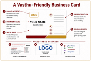
The placement of the corporate logo is equally important.
The logo represents the heart of the organisation and should occupy a position of prominence.
Placing it in the upper portion of the card naturally draws the eye first, reinforcing the
company’s identity before attention shifts to the individual’s details.
The logo should be large enough to be recognised easily but not so dominant that it
overwhelms the rest of the design.
The person’s name should remain the most prominent text after the company logo.
Print it in a clear, readable font at an appropriate size.
Decorative or overly artistic fonts often sacrifice readability.
Remember, your objective is not to impress with typography but to ensure that people
remember your name.
Generous white space is another hallmark of good design.
Many organisations attempt to squeeze every possible detail onto a business card, including
multiple telephone numbers, several email addresses, lengthy lists of products and social
media links.
The result is visual clutter that discourages reading.
White space allows each element to breathe and creates a sense of confidence, sophistication
and organisation.
The information hierarchy should also follow a logical flow.
The company logo should attract attention first, followed by the person's name, designation
and primary contact details.
Secondary information, such as office addresses, websites, or product descriptions, should be
positioned neatly without competing for attention.
When information is organised naturally, the eye moves effortlessly across the card.
Never overlook the quality of the paper itself.
A thicker card with a smooth or lightly textured finish communicates quality and
permanence.
Thin, flimsy cards often suggest cost-cutting, no matter how attractive the design is.
In business, people unconsciously associate quality materials with quality service.
Businesses involved in premium products may also consider tasteful finishing techniques
such as embossed lettering, metallic foil, or spot UV coating on the company logo.
These subtle enhancements elevate the brand’s perceived value without appearing excessive.
Perhaps the most important principle is restraint. A business card should never resemble a
miniature advertisement.
Its primary purpose is to introduce yourself professionally and leave a memorable
impression.
When the design is clean, balanced and harmonious, the recipient is far more likely to keep it
rather than discard it.
In Vasthu Sastra, harmony is achieved when every element is balanced and purposeful.
The same principle applies to a business card.
Every colour, font, shape and symbol should work together to reflect confidence, credibility
and success.
Although digital technology has transformed the way we communicate, exchanging a
business card remains a timeless gesture of respect and professionalism.
During an initial meeting, it conveys authority, sincerity and preparedness in a way that no
smartphone can fully replicate.
Your business card may fit comfortably into someone’s wallet or pocket, but it carries
something far greater than your contact details.
It carries your reputation, your brand and the first lasting impression of who you are.
Design it wisely, for sometimes the smallest card opens the biggest opportunities.
Award-winning writer Dr. T. Selva is the author of the bestsellers Vasthu Sastra Guide
and Secrets of Happy Living. To obtain a copy, WhatsApp 019-2728464. He can be
reached at drtselvas@gmail.com. Website: www.vasthuguide.com